STEEZ
Project
Magazine
Category
Page Layout
Instructor
Min Choi
Typefaces
Butler
Silk Serif
Gangster Grotesk
Duration
5 weeks
Objective
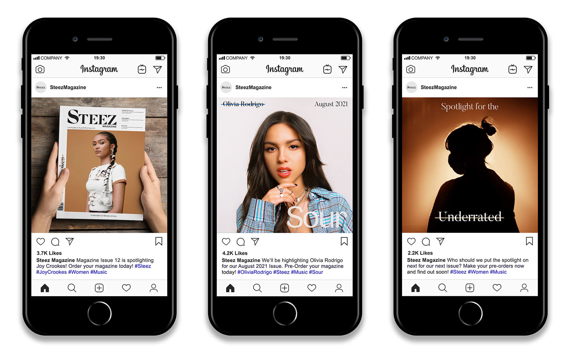
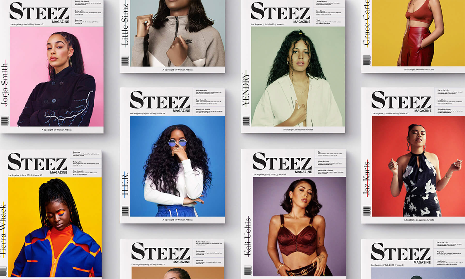
Steez is a music magazine that highlights underrated woman artists. The idea behind the magazine is to give woman under the radar a platform of recognition. The audience is catered out to women ages 15-27 who enjoy music and look for refreshing music content. This is a monthly-issued magazine that has artist interviews, album reviews, and behind the scenes of concerts. The brand is distributed with the use of colors, imagery, and contemporary design.
Solution
The use of different color cover images for the cover is to represent all different kinds of woman, no matter the color. The typeface for the masthead is Silk Serif and is used to highlight the name of the artist for that monthly issue. Throughout the spreads of the magazine, the typeface Butler is used for headings and quotes for specific hierarchy. Combined with this typeface is Gangster Grotesk, a contemporary serif font that also displays nice contrast. The magazine spreads consist of a grid system, typographic play, imagery, and a variety of color. These are all components to showcase what Steez stands for, which is harmony and feminism.